
Boston's Booming...
But For Whom?
Building Shared Prosperity in a Time of Growth


Boston is a city on the move. Our population is growing, and so is our economy. New housing is being built (although we still need much more). Established businesses are relocating from the suburbs to our region’s urban core. Entrepreneurs are starting new businesses. Immigrants are attracted here for economic opportunity, our growing diversity and our provision of social supports like decent public education.
When spring arrives and new construction projects sprout citywide, these trends are obvious to all, regardless of neighborhood. And yet, for many of us, something is off. Despite all this vibrancy and growth, despite our low unemployment rate, despite the fact that we live in one of the richest cities in one of the richest countries on earth, far too many households have a trouble making ends meet. Too many of us are struggling to afford the rent, to pay for child care and to save for college.
Most of our work at Boston Indicators goes deep on specific topics (e.g., assessing the causes of Boston’s rise in family homelessness or detailing the contributions of Latinos to our local economy), but this report is different. Here we continue a longstanding biennial tradition of pausing, taking a step back and analyzing big trends affecting our communities. For this report, we zoom out and tell a high-level story of how our economy is performing, looking specifically at trends in economic mobility and income inequality. We identify where people are being left behind, and we synthesize leading academic research into local action areas for building more broadly shared prosperity. Using this report as a jumping off point, Boston Indicators will dive deeper and elevate the most promising local opportunities through our work in the coming months and years.
The core of this report details the state of our local economy, identifying places where it’s working well and others where it’s not delivering for all. In most cases we put these trends in national (and sometimes international) context. We also often disaggregate by income levels, race, gender and neighborhood, showing that these trends affect some communities more than others. In particular, a history of unjust public policy decisions has disproportionately harmed communities of color. These include banking policies that limited lending in communities of color, sentencing guidelines that disproportionately incarcerate men of color and education systems.that provide greater resources in high-income communities. The effect of these policy decisions can be seen throughout this report, including lower incomes and wealth for communities of color; higher incarceration rates; and lower academic outcomes.
Fortunately, there’s a lot we can do to address the challenges outlined in the report, so we conclude with a brief section that presents some local action areas for building more broadly shared prosperity. We list local action areas since our geography of focus is Boston, the Boston region and Massachusetts, but it’s important to note that in order to really move the needle on these national trends, policy change also needs to happen at the federal level (e.g., reforming tax policy, reversing the trend toward market consolidation and responding more proactively to protect workers during recessions). Our list of local action areas is inspired in large part by the work of leading academics and public interest research institutions including the U.S. Partnership on Mobility from Poverty; the Hamilton Project; the Economic Policy Institute; and the Equality of Opportunity Project, particularly its reports The Fading American Dream: Trends in Absolute Income Mobility Since 1940 and Race and Economic Opportunity in the United States: An Intergenerational Perspective. In many cases we reference research into why a given action area can help improve economic opportunity, and we present some comparisons of how Boston and Massachusetts perform relative to elsewhere. Please know that we do not view this as a comprehensive list of action areas. We’ve used a good deal of our own judgment and emphasized areas where we have a bit more existing expertise to draw upon. We intend this brief final section to be a discussion starter rather than a definitive statement of what needs to be done to effect change. These areas—and many more—are ripe for further exploration as part of active efforts to build more broadly shared prosperity in a time of growth.
Economic Mobility is Down |
Economic mobility has declined across several generations.
The “American Dream” reflects an aspiration that in the United States all people should be able to work hard and climb up the economic ladder, ultimately achieving a reasonable standard of living. When realized on a broad scale the American Dream should lead to large shares of a given generation becoming better off than the prior one.
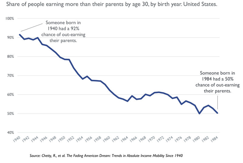
With this definition of the American Dream in mind, we start our analysis of economic mobility by looking at the share of people who end up earning more than their parents, using state-level data from the Equality of Opportunity Project’s The Fading American Dream report. The story is striking. Our economy has continued to grow in recent decades (although at somewhat slower rates in recent years), but upward economic mobility has actually been in decline. People born in the United States back in 1940 had a 92 percent chance of out-earning their parents by the time they were working-age adults (30 years old in 1970). Intergenerational mobility rates have declined dramatically over the decades since 1940, and, most recently, those born in 1984 had only a 50/50 chance of out-earning their parents by the age of 30 (in 2014). Disaggregating by gender we see that the decline has been especially steep among men—down from 95 percent to 41 percent.
Economic mobility has declined for the bottom and the top.
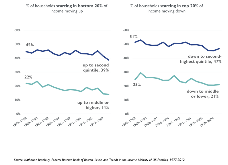
Economic mobility is also down when looking at changes within one generation, rather than across generations. Looking at intra-generational income mobility over 10-year periods, we find that fewer households move up the income ladder after starting in the bottom 20 percent of income earners (called a “quintile”) or down the ladder after starting in the top 20 percent.
In a state of fully equitable opportunity, where one begins in the distribution would have no bearing on where one ends up, and over the long-term everyone would have an equal chance of landing in one of the five quintiles. In reality, households are much less mobile than that. For both groups below, mobility over a given 10-year period has decreased, with households more likely to remain stuck where they bean. Low-income households starting in the bottom quintile in 2001, for instance, had a 47 percent chance of remaining in that quintile 10 years later.
This type of measure is zero-sum because if one household moves from, say, the bottom quintile up to the middle quintile, at least one other household must move down in relative terms, since each 20 percent bucket requires equal numbers of households. This zero-sum nature is different from the measure we showed on the previous page, where theoretically everyone could move up since there the measure of mobility was earning more income than one’s parents; if the economy grows and that growth is shared broadly, then everyone could move up at once.
The odds of achieving the “American Dream” are almost twice as high in Canada as in the U.S.
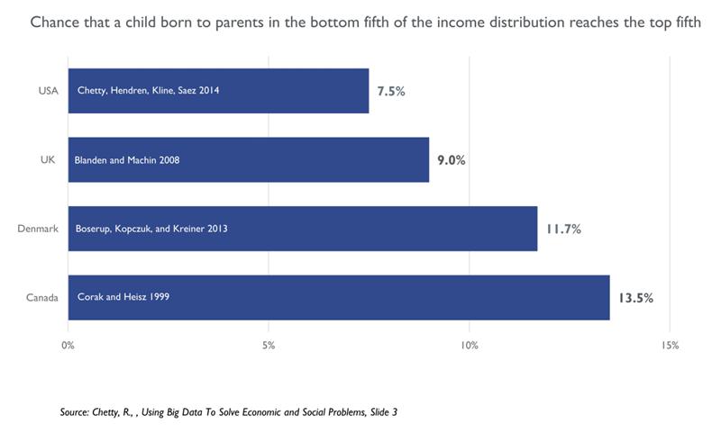
For international context, here we look at different studies of inter-generational mobility to see how current U.S. rates of economic mobility compare with a few select western democracies. Raj Chetty compiled studies that used a similar methodology, reported in the graph below, estimating the share of children born into the bottom 20 percent of the income distribution who were able to move up to the top 20 percent as adults. Strikingly, in the United States only 7.5 percent of kids growing up in the bottom fifth end up making it to the top fifth as an adult. By contrast, the likelihood of moving from the bottom fifth to the top fifth over the course of a generation is higher in the United Kingdom and Denmark and is almost twice as high in Canada (13.5 percent).
Economic dynamics vary widely across countries, so this comparison should be viewed as just one useful data point. Median household income, by contrast, is actually pretty similar in the U.S., Denmark and Canada—in the low $40,000s per year for each country in 2013.1 But since a core feature of the American Dream is the idea that anyone can work hard and move up the economic ladder, this comparison of actual bottom-to-top mobility rates shows that the American Dream may be more of an aspiration than a reality.
Economic mobility has declined in Massachusetts.
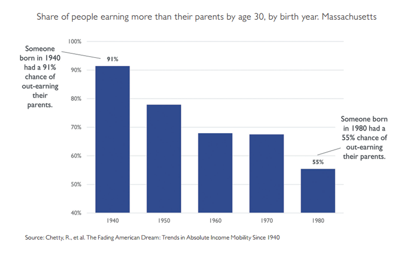
Declining economic mobility is not just a national challenge. Trends in Massachusetts mirror the national story. Those born in Massachusetts back in 1940 had a 91 percent chance of out-earning their parents by the time they were working-age adults (30 years old in 1970). These numbers have declined consistently across the decades, and, most recently, people born in Massachusetts in 1980 had only a 55 percent chance of out-earning their parents by the time they were working-age adults (30 years old in 2010).
Comparable states experienced remarkably similar declines: California declined from 89 percent for the 1940 birth cohort to 49 percent for 1980, New Jersey declined from 90 percent to 52 percent and North Carolina declined from 93 percent to 50 percent. Declines were even steeper in the industrial Midwest, where well-paying manufacturing jobs once provided solid earning opportunities for prior generations. Young people in these areas could graduate from high school, receive some vocational training, transition into a stable union job and ultimately earn enough to maintain a decent middle-class standard of living. But when the industrial base of these areas started eroding—e.g., auto manufacturing in Detroit—resulting declines in economic opportunity were dramatic. People born in the 1940 cohort in Michigan, for instance, had a 93 percent chance of out-earning their parents, whereas people born in the 1980 cohort in Michigan had only a 46 percent chance of out- earning their parents.
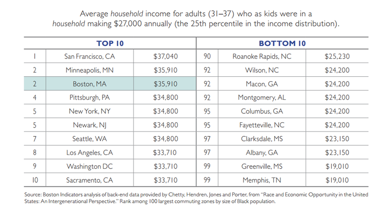
Within the context of declining economic mobility nationwide, Boston ranks high relative to other U.S. cities.
Despite mobility declining both nationally and locally, when comparing Boston with other U.S. cities on current levels of economic mobility, we actually rank high. In fact, Boston has the second-highest mobility rate among the country’s 100 largest commuting zones, according to Two Americas, from the Equality of Opportunity Project. Cities in the top 10 tend to be diverse coastal cities. All cities in the bottom 10 are in the south.
To compare cities, we use a slightly different measure from the ones discussed previously. Here, researchers started by identifying kids born into a relatively low-income household earning $27,000 a year. Then they looked at what these kids tend to earn by the time they are working adults. For Boston, someone born into a household earning $27,000 tends to end up with household income of roughly $35,910 as an adult. It’s good that most of these Bostonians move up the income distribution, but it’s noteworthy that they still land below the middle of the national distribution (an income of $41,710, or the 50th percentile).
All of these comparisons are relative, meaning that we perform well only by comparison with other cities. Regardless of this strong relative ranking, we need to better ensure that someone raised in a household earning, say, $27,000 is on a path to earn significantly more than $35,910 as a working adult. It takes much more than $35,910 to provide for one’s family when living in Boston.
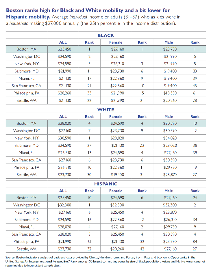
Among comparable U.S. cities, Boston ranks high for Black and White mobility and a bit lower for Hispanic mobility.
Another important way to analyze this data is to break out by race and gender. By necessity this analysis compares the individual incomes of adults in contrast to the household income of the family in which a given person was raised. We need to do this because households often contain multiple earners of different races and genders, meaning we can’t identify household income only for, say, Hispanic women. Therefore, all the dollar amounts here appear lower because we’re comparing incomes of the households in which these people wereraised with the incomes they earned as individual working-age adults.
Boston ranks relatively high when breaking out by race and gender. Boston ranks 1st for Black mobility relative to the 99 other largest 100 commuting zones in the U.S., 4th for White mobility and 10th for Hispanic mobility. (Note: This research does not report outcomes for Asians or Native Americans at the city level because there are several cities without sample sizes large enough to draw reliable estimates.)
Breaking down further by race and gender we see similar stories. Black females and Black males in Boston each rank highest overall. In fact, each Boston subgroup ranks in the top 10, except, troublingly, for Hispanic males who rank 24th among their peers in economic mobility. (See page 15.)
While Black males in Boston rank well compared with Black males in other U.S. cities, it’s noteworthy how much lower their total level is compared with all other groups, reaching an individual income of just $23,730, the 44.3 income percentile nationally. Within Boston, Black males have the lowest economic mobility. Research into major causes for this is still in its infancy, and we discuss the best current evidence more in the next section of this report; potential explanatory factors include incarceration rates and racial bias. Many more Black males are incarcerated than are people from any other subgroup, removing them from their communities and fracturing families. Incarceration rates are much higher for Black males than for other cohorts, as well, even though they commit crimes at similar rates in some of the most common categories (e.g., drug crimes).2 Further, research suggests that negative racial stereotypes may be especially harmful toward Black males.
Boston’s strong relative rankings for economic mobility—both for the population at large and when breaking down by race and gender—do suggest something important about decisions we’ve made locally to support economic opportunity for many of our residents. While Black male mobility is still far too low in Boston, for instance, one of the reasons why it’s higher here than in most other U.S. cities is that Massachusetts incarcerates Black males at the second lowest rate in the country (we detail this later in the report). Additionally, progress on K–12 structural reform and funding adequacy have helped Boston’s public schools perform somewhat better than many urban school districts; we provided universal health care to low-income families far earlier than most states; and we require more basic labor supports than in many other states (e.g., a state supplement to the federal Earned Income Tax Credit and a higher state minimum wage). These local decisions, which we describe more in the next section of this report, haven’t overcome the tremendous headwinds of larger national economic trends, but they do appear to have helped provide greater opportunity here than in most other American cities. Acknowledging these local strengths need not lead us to rest on our laurels. Rather, we can find motivation in the fact that we’ve demonstrated an ability to make some progress. We can use this track record as something to build on in becoming the city we truly aspire to be.
Of note, these city-level estimates do not take into account local differences in cost of living, meaning that the adult earnings amounts go further in some of these cities than in others. Analyzing non-adjusted adult earnings amounts is still useful, however, because the focus of this analysis is on the size of the gap between what someone’s household earned as a child with what that person earned as an adult. Each of the people/households in this analysis started at the same income level, not adjusted for cost of living.
Income Inequality is Up |
Income inequality is high in…
Among the leading contributors of declining economic mobility is recent growth in income inequality. As more income goes to those at the very top, less is available to be distributed to workers and families throughout the economy. As inequality increases, the rungs of the ladder become further apart, making it harder for people to advance upward.
International comparisons across similar countries show a strong correlation between income inequality and low levels of economic mobility. Alan Krueger, who served as Chair of the Council of Economic Advisors under President Obama, coined the term “The Great Gatsby Curve” to describe this relationship. Among developed countries in his study, countries like Denmark, Finland and Germany have relatively low levels of inequality and high levels of mobility. The U.S. and United Kingdom, by contrast, are on the other end of the spectrum, with high inequality and low mobility.1
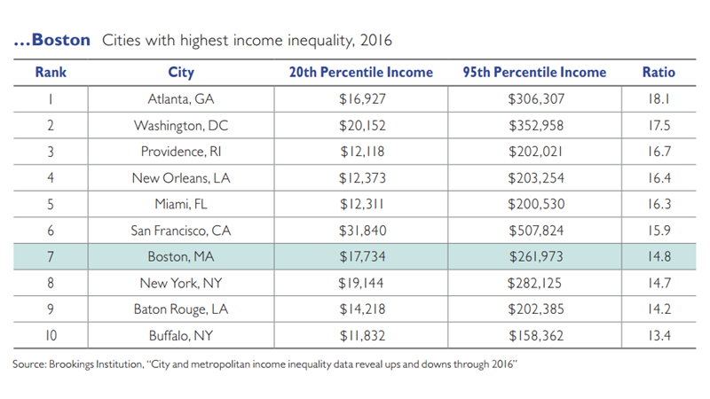
Boston ranks in the top 10 nationwide for highest inequality, according to an analysis by the Brookings Institution, which compares incomes at the 20th and 95th percentiles. Ranking high within the U.S. is especially striking considering that the U.S. overall ranks high on inequality compared with other countries in The Great Gatsby Curve analysis. Part of why Boston ranks high on this measure is that earnings at the top (95th percentile) are so extremely high, as is the case in San Francisco, D.C. and Atlanta.
While Boston ranks 7th highest for income inequality in 2016, this actually represents progress from back in 2014 when we had the very highest level of city inequality in the entire country. Because this Brookings analysis ranks cities by the ratio of income at the 95th percentile to the 20th percentile, it’s possible to improve a city‘s ranking not by increasing incomes at the bottom but by decreasing incomes at the top. Fortunately, that’s not what happened in Boston. Incomes increased for both the 95th percentile and for the 20th percentile, and the increase at the 20th percentile was proportionately higher, meaning that lower-income households in Boston saw somewhat greater gains between 2014 and 2016. There are many possible causes for this, likely among them a series of increases to the state minimum wage that coincided with this time period. Through a few annual steps, our minimum wage increased from $8 an hour in 2014 up to $11 an hour by 2017, which was the highest state minimum wage for a brief period. This spring the state just passed another plan to increase the minimum wage up to $15 an hour by 2023, which may help close the gap further.
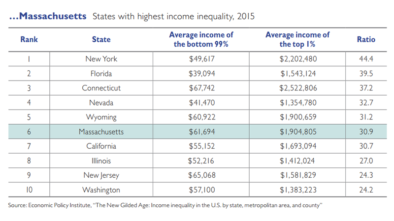
Economic inequality is also stubbornly high at the state level in Massachusetts. The Economic Policy Institute’s report The New Gilded Age: Income Inequality in the U.S. By State, Metropolitan Area, and County looks at trends in state-level income inequality from the late 1970s through the Great Recession, and fnds that income inequality is high in Massachusetts by almost any measure. In 2015, for instance, Massachusetts had the 6th highest ratio of average income for the top 1 percent of households to the average income of the bottom 99 percent. Massachusetts is also one of nine states where in recent years the top 1 percent has captured half or more of all income growth; the top 1 percent in Massachusetts received 58 percent of all income growth between 2009 and 2015.
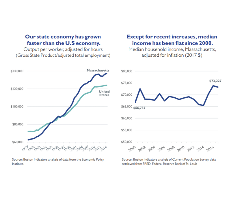
Even though our state economy has become more productive, median incomes have grown very little.
In many other states, declining economic mobility is caused by a weak economy where opportunity is slowing for everyone. We have a growing economic pie that positions us well to provide greater economic opportunity to a broad swath of our residents and workers. Economic productivity has increased over the past 40 years, outpacing the nation as a whole since the early 1990s. Economic productivity is an important, high-level measure of how well an economy is functioning because it looks at all the value created by workers in our local economy.
The most significant local change came during the “Massachusetts Miracle” of the 1980s where the financial services and technology sectors expanded rapidly. In early years, this activity was largely concentrated in the Route 128 loop outside of Boston. Growth slowed a bit during the economic recession of the early 1990s, but only temporarily. Over the past 20 years or so, our economy has grown further, with much of that activity concentrated closer to Boston and the urban core.
Despite this strong economic growth, however, incomes in Massachusetts have been relatively flat for most of the 2000s (adjusted for inflation). Households at the median did experience important gains from 2014 to 2016, but median income leveled off again in 2017.
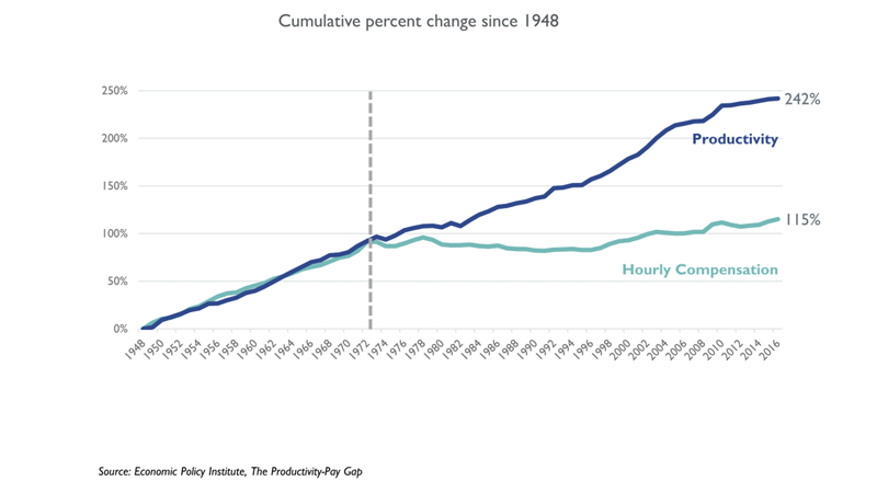
The gap between productivity and a typical worker’s compensation has increased dramatically since 1973.
Slowing wage growth in Massachusetts is part of a much larger national trend, demonstrated by this longer-term graph comparing economic growth (productivity) with wage growth (hourly compensation) nationwide.2 During the immediate post–World War II period (1948–1973), wages grew right in line with economic productivity; as the economy grew, the fruits of that growth were shared broadly with workers across the spectrum. A rising economic tide really was lifting most boats. This has changed dramatically since the mid-1970s. Wages have not risen alongside economic growth. And the size of the gap between productivity and wages has increased over time.
What occurred in the early 1970s is not one single policy change, but rather the beginning of a series of macroeconomic policy changes and shifting business practices that have served to erode worker bargaining power. Rates of unionization have declined, especially in the private sector, leading to fewer workers having guaranteed middle-class wages and other non-wage benefits like paid vacation and sick time. Business consolidation has led to fewer employers competing for workers in a given market. And basic labor market protections have been scaled back, including a decline in the real value of the minimum wage and a reduction in the share of hourly workers covered by overtime guarantees. Local decisions matter a lot too, and we discuss local areas for action in the final section of this report, but these national decisions set the broader context within which our local decisions are made.
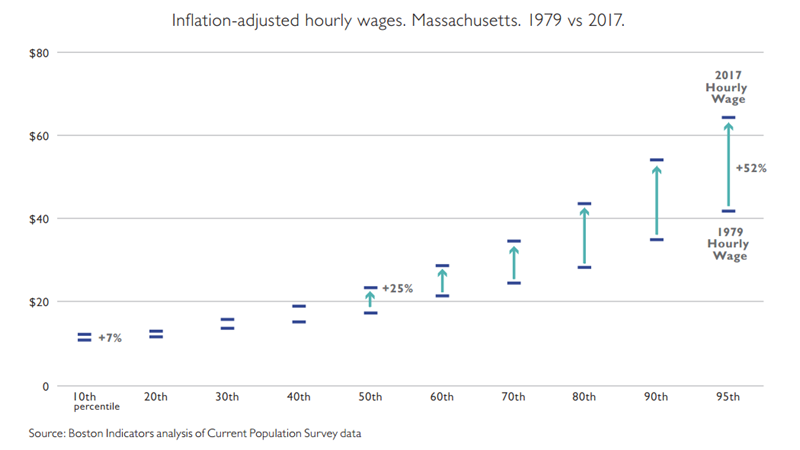
State economic growth has not been broadly shared.
Not only have wages grown very little for people in the middle, but they’ve grown little for everyone except those at the top of the distribution. This graph shows state-level trends back to 1979 and presents it for multiple points in the income distribution, showing a stark picture of growing income inequality here in Massachusetts.
People at the very top—the 95th percentile, in this graph— experienced inflation-adjusted wage increases of 52 percent from 1979 to 2017. People in the middle saw modest increases of 25 percent, and people in the bottom 10th percentile saw increases of only 7 percent.
Looking just at wages (i.e., “labor income,” which refers to direct pay from an employer for working a job) almost certainly understates actual growth at the top of the distribution because a disproportionate share of those earners’ income comes from non-wage sources such as income from owning a business or from owning stocks. According to the Congressional Budget Office, households at the middle of the distribution make about 80 percent of their income from labor income, whereas households in the 96th to 99th percentiles generate 70 percent of their income from labor. The difference is even more striking for the top 1 percent, whose total income includes only 36 percent labor income.3 Due to technical challenges our analysis does not combine all of these sources of income, but if it did, the gap between income growth for those at the top and all others would be even larger than what we present here.
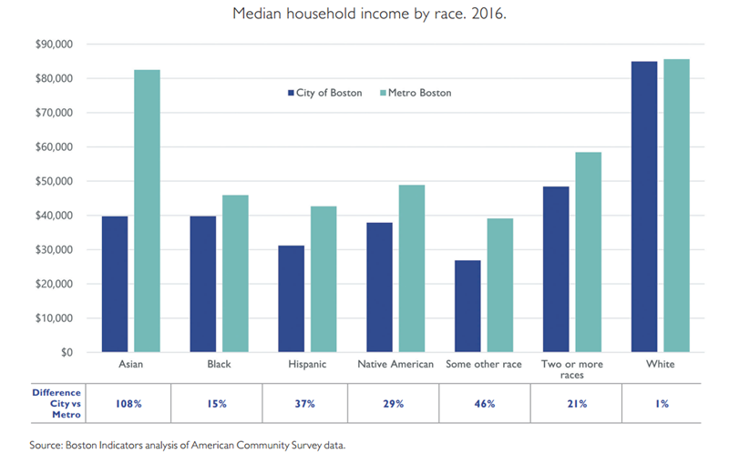
Income varies widely by race in Boston and Metro Boston.
Income in Boston also varies widely by race. Within the city, White household income is roughly two times as high as that for other racial/ethnic groups. These disparities close a bit when looking at all of Metro Boston, which is a large area defined by the Census Bureau as reaching up to southern New Hampshire and down to the border of Rhode Island.
Interestingly, White incomes are roughly the same in Boston and Metro Boston, whereas Asian incomes more than double for the broader metro area. Several different factors are likely behind this variability within the Asian community. Perhaps largest among them is the fact that “Asian” is an especially broad, heterogeneous racial category. In 2015, for instance, 72 percent of working-age Indians living in the U.S. had college degrees in contrast to only 9 percent of Bhutanese. Median household income within Asian communities in the U.S. ranges from $36,000 for Burmese to $100,000 for Indians.4 Variation in immigration patterns may also help explain the difference in Asian incomes, with some lower-income immigrants first coming to the city and then moving to the suburbs as they become more affluent. Other immigrants with higher skills may move straight to the suburbs without ever living in the city of Boston.
Economic growth used to be broadly shared in the U.S., and it mostly still is in Western Europe.
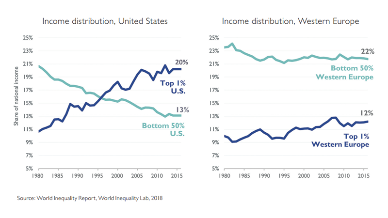
Income inequality has not grown nearly as fast in some other parts of the world. Back in 1980, the bottom 50 percent of workers received pretty similar shares of national income in the United States (21 percent) and Western Europe (24 percent). But this distribution changed dramatically in the U.S. over the past 35 years, while it’s remained relatively consistent in Western Europe. The top 1 percent in the United States now receives significantly more income than the entire bottom 50 percent (20 percent vs 13 percent). The top 1 percent’s share has increased a bit in Western Europe, but this increase pales in comparison to the gains made by the top 1 percent in the U.S.
Who gains from overall prosperity is driven by the policy choices we make about how we steer economic growth. Western Europe has lower inequality due in part to higher taxes, larger social support programs and systems that give workers greater bargaining power. But these national economies are also smaller than ours on a per capita basis, leading people to have a lower average standard of living. This observation doesn’t mean that we shouldn’t compare outcomes across the Atlantic, but we should do so with caution and by considering many factors at once.
Boston's Middle Class is Hollowing Out |
Rising home values are squeezing out much of Boston’s middle class.
To understand the decline in Boston’s middle class we need to go beyond just analyzing household financial resources—e.g., incomes, wages, wealth—and consider the big cost drivers that offset these resources, especially the high cost of living in this region.
Certain life cycle patterns and personal preferences once helped moderate housing cost increases in Boston. University students graduated and left the city. Companies tended to locate outside of Boston in the suburbs. Seeking larger homes, young professionals were eager to move out of the city once they had kids. And older people living without kids were more likely to remain in the suburbs or move elsewhere once their kids were grown up. Not anymore. Preferences of young professionals have changed, with many more likely to want to stay in Boston. Many businesses have responded by locating back closer to the urban core. Young families are more willing to sacrifice space to stay in the city. And more empty nesters downsize and move back to the city.
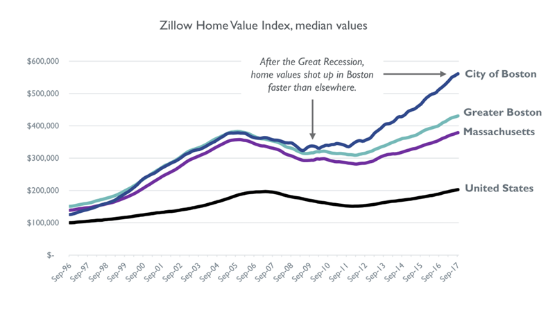
This increased demand to live in Boston is generally a very good thing, reflecting the desirability of living in our city. Median home values1 nationwide have just rebounded to their pre–Great Recession levels, but local home values have risen dramatically since 2010, with the sharpest increase inside the city of Boston. Specifically, nationwide home values are only 3 percent higher than their previous peak, whereas home values in Boston are now 48 percent higher than their previous peak.
These local increases of course benefit longstanding homeowners, but they create a rising barrier to homeownership for renters who make up roughly two-thirds (65 percent) of residents in Suffolk County.
Middle-income families have a hard time “affording” Boston rents.
As the largest cost most families incur, sharp housing cost increases can significantly restrict economic opportunity, especially when they outpace wage gains. This is what’s happening locally: At the same time that housing costs have skyrocketed in Boston, wages have stagnated for most workers.
So what does this all mean for the middle class? Can families in the middle realistically afford to live in Boston if they aren’t property owners who bought into the market years ago?
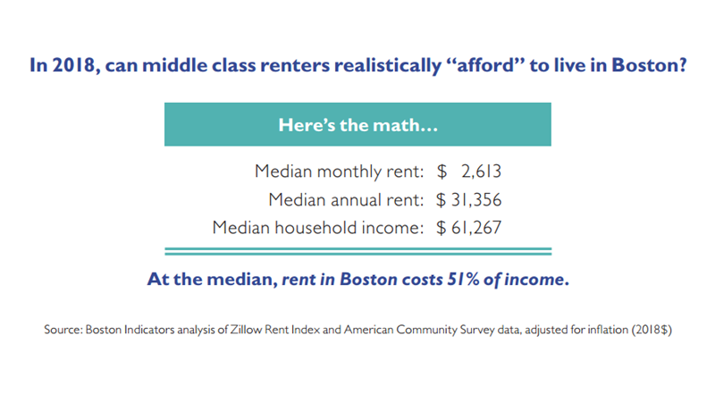
Here’s a simple way to think about it: Median monthly rent for new listings in Boston is $2,613/month, or $31,356/year. That’s 51 percent of median household income in Boston. A common benchmark in the housing policy world defines households that spend more than 30 percent of their income on housing to be “housing cost burdened” and those that spend more than 50 percent to be “extremely housing cost burdened.” This means that a household earning at the median and paying median rent for a current listing is extremely housing cost burdened in Boston.
In almost all Boston neighborhoods, households earning median income cannot “afford” median rent.
While instructive, the comparison of median rents in Boston to median household income looks just at citywide data, and since we know that incomes and rents vary widely across the city, we‘ve done a more nuanced analysis that makes these calculations for each census tract in Boston. In almost all of Boston—150 out of 170 residential census tracts—households earning median income for that tract cannot “afford” median rent in that tract.
For any census tract where median rent is more than 30 percent of median income we note that, no, households earning at the median cannot “afford” median rent, and we code these in dark blue. The vast majority of census tracts in Boston end up being a No on this score. In fact, it’s striking that wide swaths of several neighborhoods that were once thought of as affordable actually are not according to this analysis. In 2018, every single census tract in Dorchester, Roxbury and Mattapan is unaffordable to households earning median incomes.
It’s not the case that middle-class families literally cannot live in neighborhoods where it takes more than 30 percent of income to afford rent. Rather, they must adjust in order to pull it off, including things like: spending more than 30 percent of their income on rent and making sacrifices in other ways, living in less desirable units, doubling up with other friends or family, and going into debt. Affordability

The size of Boston’s middle class is shrinking.
The increase in cost burdened households has resulted from the convergence of two trends detailed earlier in this report: 1) income stagnation and 2) increasing rents/housing costs. This combination has proven quite a challenge for many Bostonians and is a core cause behind the hollowing out of our middle class.
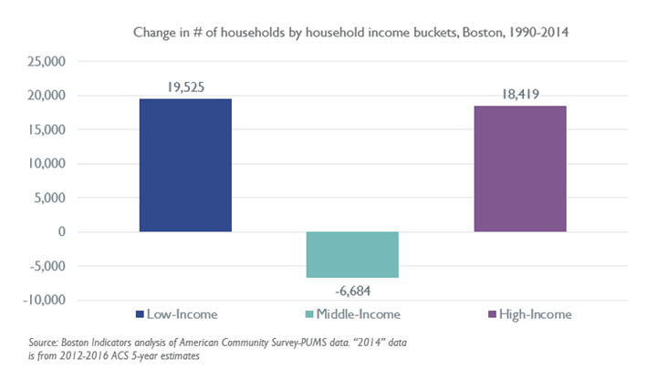
Specifically, over the past few decades, the number of households at the low and high ends has grown.2 From 1990 - 2014 Boston increased the total number of households by 31,260, and yet we lost 6,684 households in the middle of the distribution.3 Growth in high-income households reflects expansion in higher-skill, higher-wage occupations like financial services, health care and information technology (as we detail next). This high-income growth is also a consequence of rising housing costs; as demand to live in Boston dramatically outpaces the production of new housing, higher-income households are the only ones equipped to stay and pay market rates.
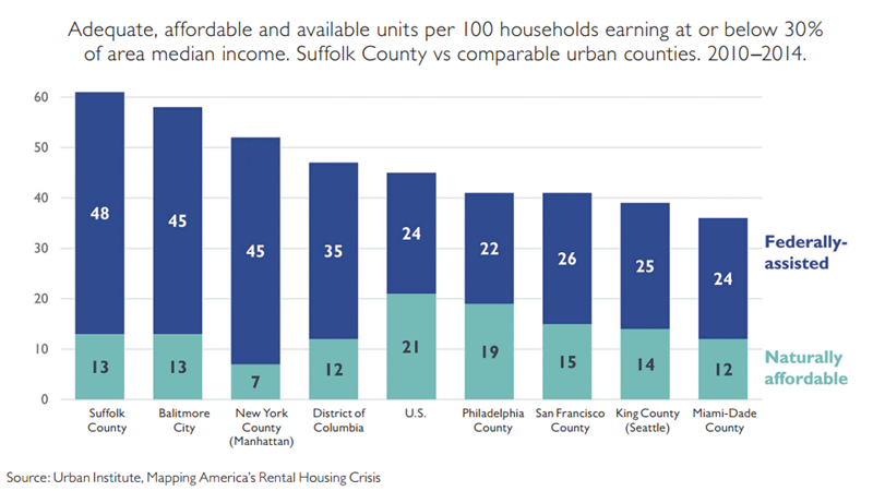
While no counties have enough, Suffolk County has more affordable housing for extremely low-income residents than comparable counties.
While households dropping from a middle- or high-income status in 1990 could possibly account for some of the growth in the low-income category by 2014, it’s unlikely that this is the bulk of what’s going on. As housing costs have skyrocketed, the City of Boston has made a commitment to maintaining and growing the number of public housing supports for low-income families—through “inclusionary development” requirements, for instance, that ensure new multifamily housing projects set aside a share of units for below-market rents. Compared with similar urban counties in the U.S., Suffolk County actually ranks rather well in terms of the number of adequate, affordable housing units available for households earning at or below 30 percent of median income. For every 100 “extremely low-income” households in Suffolk County, according to this Urban Institute analysis, Boston has made 61 affordable units available. By contrast, the U.S. average is to make only 45 units available per 100 extremely low-income households.4 This commitment to providing low-income housing has likely contributed to the increase in low-income households shown in this analysis.
Some of this growth in low-income households may be further driven by our increasing foreign-born population. These immigrants tend to be more upwardly mobile than the rest of our population, as we discuss later in this report, but they are first attracted to Boston as a place of opportunity upon entering the country.
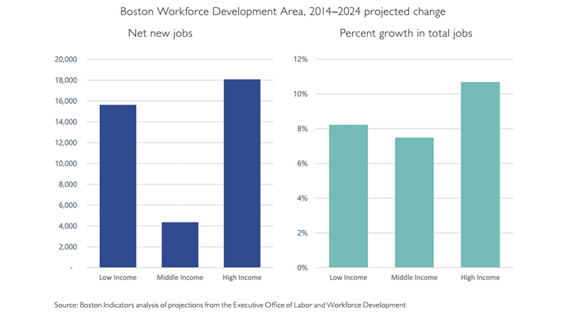
The state projects less middle-income job growth.
Mirroring the trend of declining middle-class households, middle class occupations have also been on the decline locally. Our economy is growing, which on the whole is a very good thing, but this growth has brought a disproportionate share of new jobs that are either high-paying or low-paying, with much slower growth in middle-income jobs.5 This dynamic reflects broader shifts in our economy. Nationwide we’ve seen growth in lower-paying service sector jobs (e.g., food service) and growth in higher-paying jobs, especially in health care and financial services, with stagnation in the middle.
Poverty Persists |
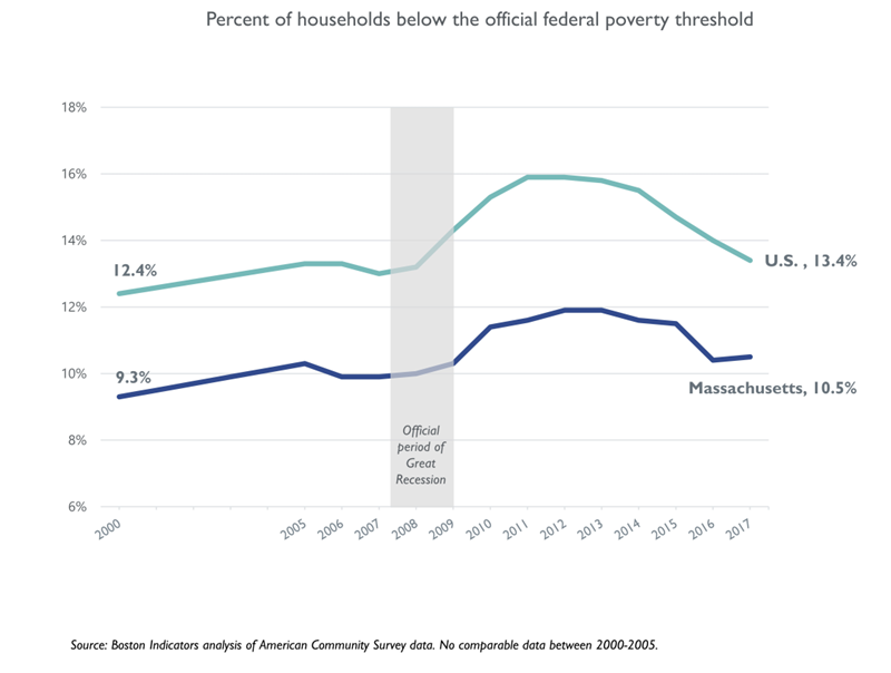
Poverty is lower in Massachusetts, but remains elevated post–Great Recession.
In a thriving economy, we should at a least provide everyone with the basics, regardless of trends for middle- and upper-income households. For more than a decade Massachusetts has had a lower poverty rate than the U.S. overall, according to the federal government’s official poverty measure. No doubt this is good news, suggesting that our local economy is providing better opportunities for people to maintain a (very) basic standard of living.
The bad news, however, is that one in 10 of our households still lives in poverty, despite the fact that Massachusetts is one of the wealthiest states in the United States. Further, the official poverty threshold really is a low bar; poverty for a family of three in 2017 was about $19,730 per year.
Additionally, while poverty has decreased over the past few years both in Massachusetts and the U.S., our 2017 rate (most recent available data) remains elevated post-Great Recession. With the Great Recession officially ending in June of 2009, by 2017 we were eight years into an economic recovery, and yet our poverty rate of 10.5 percent was still above its immediate pre-recession level of about 10 percent. Clearly our recent economic recovery has not benefited all of our residents, including many of those at the bottom of the distribution.
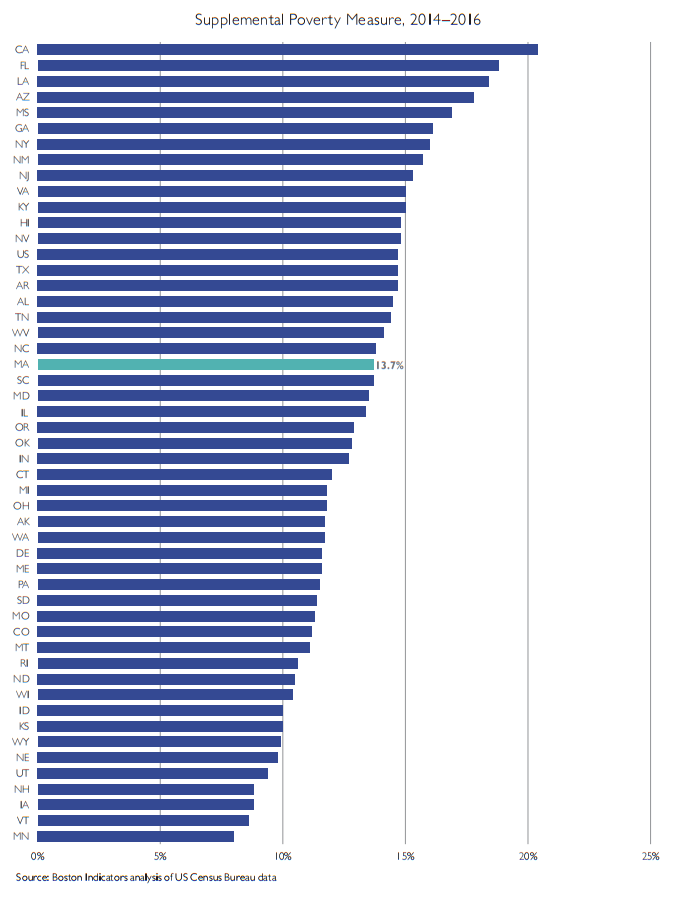
By a more accurate poverty measure that factors in cost of living, Massachusetts is in the middle of the pack.
The government’s official poverty measure is generally understood to be very crude, even though it’s widely used (chiefly for the purposes of continuity back to the 1960’s). In short, it’s an inflation- adjusted calculation of three times the cost of a minimum food diet in 1963. Recognizing the many limitations of this approach, the U.S. Census Bureau recently developed a more nuanced alternative called the Supplemental Poverty Measure. Using this measure the story in Massachusetts is significantly less rosy, as we end up being much more typical of the U.S. overall. According to the most recent data, at 13.7 percent our current Supplemental Poverty Measure (SPM) rate is higher than that of 29 other states.
Rather than making a simple calculation of income, which is what the official measure does, the SPM makes several other adjustments, including adjustments in two key categories: 1) it adds non-cash income received by households that help them make ends meet (e.g., food stamps/SNAP, Social Security and tax credits like the Earned Income Tax Credit); and 2) it adjusts income by local differences in cost of living.
Some states actually see reduced poverty rates under the Supplemental Poverty Measure, usually because their local cost of living is lower than typical. Massachusetts is at the other end of the spectrum, with our much higher cost of living contributing to a significantly higher supplemental poverty rate.
Much of what drives the state’s high cost of living are particularly high costs in the Boston area. Among the 383 metro areas defined by the Census Bureau, Boston’s cost of living was 16th highest in 2016. Our large metro area, which actually stretches up into southern New Hampshire, has a cost of living that’s 11 percent higher than the national average, according to the Bureau of Economic Analysis’s Regional Price Parities index. Because costs are so much higher in Boston proper than they are in the outer reaches of this region, an RPP that measured only Boston’s costs would almost certainly show an even greater gap compared to the national average.
While the picture is somewhat bleak for us in Massachusetts, several other states see even larger increases under the SPM. California provides the most extreme example, serving as a cautionary tale; it moves from 16th highest under the official poverty rate to the very highest under the SPM. Home values in both Massachusetts and California have skyrocketed in recent years (we investigate these trends for Massachusetts later in this report), but California’s increase since the peak of the recent housing crisis has been even more pronounced than ours. In January of 2012, median home values in California were $300,000 versus $275,000 in Massachusetts. As of January of 2018, California is up to $530,000 (+77 percent) whereas Massachusetts is up to $389,000 (+41 percent).
Tracking poverty rates through the Supplemental Poverty Measure helps us keep on top of the impact that trends like housing cost increases are having on people at the bottom of the income distribution. The current data suggest that we’ve got a real problem here, and that we haven’t necessarily hit a ceiling on how far our rising cost of living might go, absent action to address the problem.
Wealth Disparities are Growing |
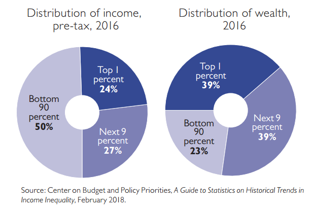
Wealth inequality is greater than income inequality.
A growing body of national research tracks total wealth (i.e., net assets after factoring in debt and adding up home values, savings, investments and retirement accounts) by income and by race, and we see that wealth inequality is even greater than income inequality. Nationally, the bottom 90 percent of households earn 50 percent of income while they only have 23 percent of total wealth. By contrast, the top 1 percent of households earns 24 percent of income and claims 39 percent of total wealth.
Availability of wealth tells us a lot about how households pay for big investments, like college education, and weather unforeseen shocks in their lives, like losing a job or facing an expensive medical emergency. Wealth is an important indicator that is often missing from economic analyses, in part because detailed local data is less readily available.
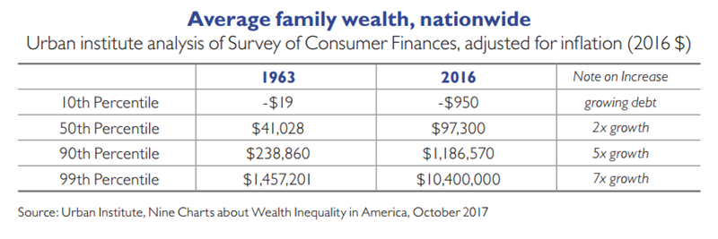
Further, not only is wealth inequality greater than income inequality, but wealth inequality has been growing over time. According to the Urban Institute, between 1963 and 2016, families at the bottom of the wealth distribution saw a decrease in wealth, families in the middle saw a doubling in wealth and families at the top saw a fivefold increase.
To a certain extent, it’s not surprising that wealth inequality is greater than income inequality because wealth is passed across generations and can have a compounding effect. But policy choices can make a difference. The federal estate tax has been cut significantly over the past several decades and most of the federal government’s support for homeownership goes to the home mortgage interest deduction, which supports all homeowners regardless of income or whether a home is a wealthier household’s vacation home. Shifting federal housing incentives toward lower-income, first-time homebuyers is the sort of policy change that could help reverse these wealth trends.
We have a large, persistent racial wealth gap in the U.S.
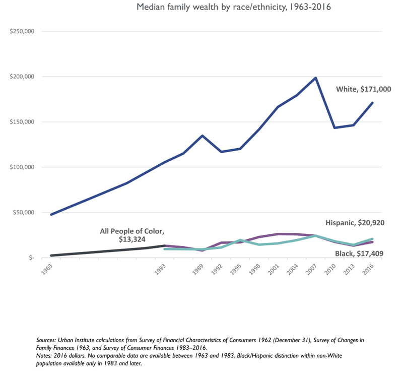
In addition to growing wealth disparities across households of different income levels, we have a large and growing racial wealth gap in the U.S. The size of the gap varies by data sources and by who’s making the estimate, but most national research shows White households having significantly higher net household wealth than other racial/ethnic groups. According to the Urban Institute, median White family wealth was $171,000 compared with around $20,000 for Black and Hispanic households in 2016. (Their analysis was limited to these groups because the sample sizes of the Survey of Consumer Finances are not large enough to reliably report detail for smaller groups like Asians or Native Americans. According to other research, Asian family wealth tends to be higher than other non-White groups.)1
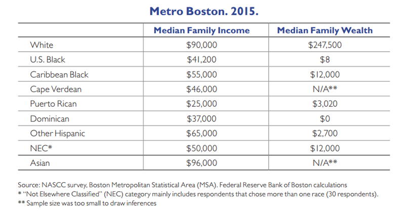
In Boston, racial wealth inequality is also greater than income inequality.
To help fill the void of quality data on wealth at the local level, a few years ago the National Asset Scorecard for Communities of Color (NASCC) was developed and administered in several U.S. cities, including Greater Boston. This work was led by William Darity and Darrick Hamilton in close partnership with the Federal Reserve Bank of Boston, and it resulted in 2015’s Color of Wealth in Boston report. The NASCC survey’s findings are consistent with research on wealth and race nationally: There’s a large, persistent racial wealth gap, and that gap is even greater than gaps in income.
As a long-term, cross-generational measure, wealth is a tough economic indicator to move, yet it may ultimately be the most important measure of how equitable we are as a society. It’s hard to imagine a future state in which there’s very little difference in median wealth across race without having made significant policy reforms in housing, work protections, education and without also having dramatically reduced racial prejudice across all aspects of society. Ta-Nehisi Coates put this well in a recent podcast interview where he was asked what it would look like if racial justice had truly been achieved in America. He responded quickly, saying that the best indicator of having achieved justice would be “if there were no wealth gap…that would be the immediate tell for me…So much is implicit in [wealth]. When you have wealth you have a safety net. It’s not just that individual Black families don’t have much wealth. It’s that individual Black families without wealth almost totally live around other Black families without wealth. There’s a kind of webbing that happens—social benefits, cultural benefits, access to other people—(that people without wealth get cut off from).”2
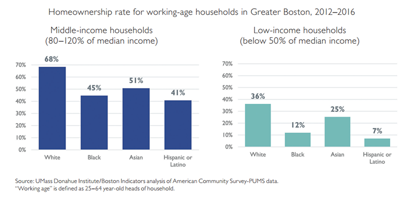
White Bostonians are able to own homes at higher rates, even when controlling for income.
For those who can afford to own, a family’s home is often its most valuable asset. While we can’t track total assets using Census data, we can analyze homeownership rates and learn something important about this core form of wealth at the local level in Boston. Because White families tend to have higher incomes, it’s not surprising that they own homes at higher rates than other races. But it turns out that gaps in homeownership exist even when comparing working age households (25–64 year-old head of household) at similar income levels, as we show below. More than two-thirds of middle-income (between $62,000 and $93,000/year) White households own homes in Greater Boston, while only about half of middle-income Black, Asian and Hispanic households do. This gap grows even wider for low-income households earning below 50 percent of median income (below $39,000/year). More than a third of low-income White families are still able to own homes in Greater Boston, much higher than the rates for Black (12 percent), Asian (25 percent) and Hispanic or Latino households (7 percent).
Gaps like this in homeownership become a self-perpetuating cycle, where families that own homes are able to pass that wealth on to their kids, making it more likely that the next generation will also be homeowners, even if they themselves are in lower-paying jobs. It really is striking that more than two-thirds of low-income White households are still able to own homes, in large part because of the transfer of wealth across generations. Other factors like discrimination in loan making further fuel this cycle of disparity.
For this analysis, we look at Greater Boston because a large majority (two-thirds) of people living in the city are renters. Disparities in homeownership by race within Boston are quite similar to these graphs for Greater Boston, just with homeownership at lower levels for everyone.
Local Action Areas for Building MoreBroadly Shared Prosperity |
Reversing the big economic challenges detailed in the first section of this report requires action on the national level, including: implementing policies to rebalance bargaining power between workers and employers, providing greater research investments to boost economic productivity, making tax policy changes, and pursuing more proactive fiscal and monetary policy responses to recessions so that we have tight labor markets for longer periods of time. While there’s work we can do in Boston to advance these national efforts, we should act simultaneously on the local level to effect change more immediately. Therefore, we conclude this report with an exploration of several promising local action areas for building more widely shared economic prosperity. The areas we highlight here are quite broad. Some are areas where Boston has performed reasonably well compared with elsewhere in the U.S., but where we still know we could do much more (e.g., “Expand basic labor force protections”). Others are areas where we are not national leaders and need to do much better (e.g., “Reduce housing costs”).
In many cases we reference research into why a given action area can help improve economic opportunity, and we present some comparisons of how Boston and Massachusetts perform relative to other parts of the country. It’s important to stress that this list is nowhere near comprehensive. It’s constructed by scanning the work of other leading researchers, using a good deal of our own judgment and emphasizing areas where we have more existing expertise to draw upon. We intend this list to be a discussion starter, rather than a definitive statement of what needs to be done to effect change. These areas—and many more—beg further exploration if we are to succeed in reshaping Boston’s economy to become more balanced and inclusive.
IMPROVE QUALITY/AFFORDABILITY OF OUR EDUCATION SYSTEM
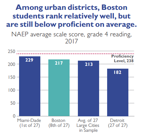
As our economy continues to shift towards high-skill occupations, we must work to improve the quality and affordability of our education pipeline from early childhood education to K–12 education and through to higher education. Compared with other urban school systems, Boston’s K–12 schools begin from a position of relative strength, although there’s huge room for improvement. According to the National Assessment of Educational Progress (NAEP), Boston students rank 8th out of 27 cities tested in fourth grade reading, a measure that’s indicative of the performance both of our early education providers and the early grades in our K–12 schools. Further, when we focus just on the performance of low-income students and break out by race, our low-income Black students rank 3rd among their peers; our low-income White students rank 1st and our low-income Hispanic students rank 5th. Despite these strong relative rankings, the NAEP data also show that we are far from having prepared all of our students to thrive fully in college, career and life; on average Boston students still score below the NAEP’s definition of “proficiency.”
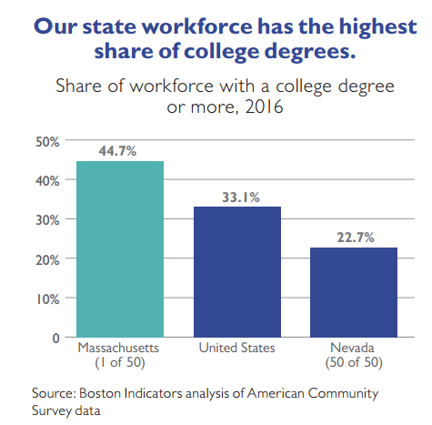
It’s more challenging to analyze the performance of Massachusetts students in higher education since many attend schools in other states and since public and private institutions within Massachusetts accept students from elsewhere. One way to look at the role that college degrees play in our local economy, however, is simply to analyze the share of our workforce with a college degree or more. This assesses both the availability of workers with college degrees and the supply of higher-skill jobs that require them. And on this measure we lead the nation, at 44.7 percent.
Our public system of higher education—community colleges, state universities and the UMass system—is of special importance when considering local action since graduates of these campuses are significant more likely than graduates of private institutions to remain in state after graduation and contribute to our economy over the long-term (60 percent vs 38 percent). Despite the economic importance of these public graduates, the state cut support for higher education by $3,000 per student (adjusted for inflation) between FY 2001 and FY 2017. Over the same timeframe, tuition and fees have increased $4,600 per student.1
SUPPORT THE CREATION OF GOOD JOBS AND PROVIDE WORKFORCE TRAINING LADDERS FOR THOSE WITHOUT BACHELOR’S DEGREES.
With Boston’s economy increasingly shifting toward high-skill, high-wage jobs, we must do more to provide decent jobs for workers who do not have a bachelor’s degree. Part of the equation needs to be providing strong workforce training opportunities so that people with an industry-specific credential or an associate’s degree (home health aides, for instance) are given the opportunity to receive more training and progress upward within a given sector (i.e., becoming a higher-paid nurse). Providing opportunities to progress throughout one’s career can make a tremendous difference in a household’s long-term economic trajectory.
FIX THE JOBS-HOUSING MISMATCH/IMPROVE OUR TRANSPORTATION SYSTEM.
Boston is fortunate to have one of the only six legacy transit systems in the U.S. Today, more than a third of our region’s jobs (37 percent) are within half a mile of an MBTA or commuter rail station.2 But for people to rely on it day to day, our aging transit system requires regular maintenance and upgrades, and in recent years, reliability has declined dramatically. Boston has the oldest fleet of buses among the six legacy transit systems and the second-oldest fleet of subway cars.3 This deterioration coincides with rising housing costs in the center of the city. Rebuilding, and potentially expanding, our transit system would alleviate economic pressure on families by allowing them to move to areas with lower housing costs and still reliably travel to jobs elsewhere in the region. Improving transit also gives workers more flexibility to consider alternative job opportunities further from their homes, leading to better matches in the local labor market.
ELIMINATE RACIAL BIAS.
While some of the racial disparities we detail in this report are the direct result of skewed public policy decisions (e.g., the history of limiting access to federal home loans in communities of color), it’s clear that interpersonal racial bias also plays a role. Racial prejudice against Black males, for instance, can impede their professional advancement as they often face potent negative stereotypes in the workplace. According to the Equality of Opportunity Project’s recent Two Americas paper, places with higher rates of racial bias (as evidenced through internet searches and a racial bias assessment tool) tend to have lower rates of economic mobility for communities of color.
REDUCE RESIDENTIAL SEGREGATION.
Reducing residential segregation is critical for increasing economic mobility. Segregated neighborhoods receive disparate economic investment and kids in lower-income neighborhoods often end up attending worse schools. Small ethnic enclaves can strengthen ties within a given community, but broad-based segregation often reduces opportunity overall. While effects vary by race and ethnicity, high levels of racial segregation are associated with lower per capita incomes and lower educational attainment levels.4
Once a predominantly White city, Boston has grown to be quite diverse in recent years, but our relative level of integration lags what one would expect given our newfound diversity. The data-driven journalism website FiveThirtyEight created an integration-segregation index to compare cities on both of these dimensions. Boston ranks in the bottom half of their analysis (70th out of 100) because our integration score underperforms what we would expect given our diversity.5
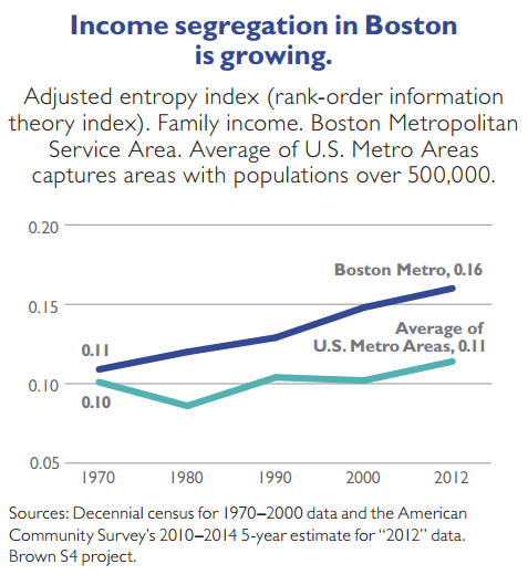
Further, segregation based on income is on the rise in the Boston region. Brown University’s Spatial Structures in the Social Sciences project uses an adjusted entropy index to measure income segregation. It’s calculated by looking at the variation in family income at a neighborhood level (i.e., census tract) and compares that to the income variation in the region overall. From 1970 to 2012 income segregation increased in the Boston region by 45 percent, significantly faster than increases across other U.S. metro areas.
REDUCE INCARCERATION RATES.
A growing body of research documents the negative effects of mass incarceration in the U.S., especially on communities of color. Not only are there social consequences to mass incarceration, but there are economic consequences as well. Formerly incarcerated people often have far fewer employment opportunities after reentry. For men, incarceration reduces annual earnings by 40 percent after they serve their sentences. Not surprisingly, the reduction in family incomes is also steep. In the year after a father is released from prison, his family’s income is 15 percent lower than it was in the year before he went to prison.6
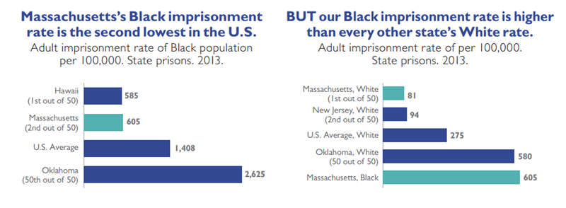
Fortunately, our state imprisonment rate in Massachusetts is second-lowest in the country,at 156 per 100,000 residents. States with the highest imprisonment rates, like Louisiana and Oklahoma, are more than four times as high as ours. This means that fewer Massachusetts residents—parents, siblings, friends, co-workers—are being removed from neighborhoods,unable to contribute to our communities and our economy. While we compare favorably to other states in the U.S., we still imprison way more of our population than many other western democracies, with our incarceration rate more than twice as high as that of countries like the United Kingdom, Canada and Italy.7
When we break out data by race and look just at our imprisonment rate of Blacks in Massachusetts, we also rank well, second-lowest only to Hawaii. But this low ranking masks a much deeper problem: Black people are imprisoned at significantly higher rates than people of other races, even though they commit crimes at similar rates in some of the most common categories of crime (e.g., drug crimes).8 The accompanying graphs put this into context by showing that our state incarceration rate for Blacks, while lower than most Black incarceration rates in other states, is still higher than every other state’s White imprisonment rate.
REDUCE HOUSING COSTS.
High housing costs can significantly limit a family’s economic opportunity, especially when housing cost increases outpace wage gains over an extended period of time. This is largely what’s happening locally; just as wages have stagnated for most workers, housing costs have skyrocketed in Boston. Absent action to dramatically reduce housing costs—e.g., permitting the construction of multi-family housing in Boston and near transit nodes further outside the city core—wages can rise modestly and still not translate into higher standards of living.
SUPPORT THE ESTABLISHMENT OF STRONG SOCIAL CAPITAL.
The concept of social capital refers to the strength of social relations in a given community. When social capital is high, neighbors keep an eye out for one another, friends network and support each other’s career advancement, and older generations help younger people navigate systems that are new to them like college application or financial aid processes. Although social capital is somewhat amorphous it’s closely related to other factors we’ve discussed in this paper. Social capital is higher, for instance, when residential segregation and incarceration rates are low. Labor unions and religious institutions once played a more central role in some Americans’ lives, serving to boost social capital for active members. As some of these institutions have waned in influence, we should look for, and consider developing, other vehicles that support the building of social capital.
EXPAND BASIC LABOR FORCE PROTECTIONS.
As union membership has declined in the U.S., workers tend to have fewer basic employment supports that were more commonplace for prior generations. Fewer workers receive overtime pay when working especially long workweeks, and fewer workers have guaranteed sick and vacation time. In recent years, however, Massachusetts has taken steps to reinstate or strengthen some of these important protections. This spring, for instance, the Legislature responded to years of grassroots organizing by creating a paid family leave program and passing a law that will increase the state’s minimum wage up to $15 an hour by 2023. This new level is projected to raise the wages of about 800,000 workers in Massachusetts, or about a quarter of the state’s workforce.9
PROVIDE AFFORDABLE, ACCESSIBLE, HIGH-QUALITY HEALTH CARE.
Not only does access to good health care have obvious health benefits, it also has important social and economic benefits. Access to affordable health care can improve mental health, both through the direct access to mental health services and by mitigating the stress associated with not knowing how you’ll weather health crises without the backdrop of insurance coverage. Having health insurance also makes families much more economically stable, by helping them avoid extreme financial shocks when someone gets sick and by helping adults continue working as health issues are resolved faster.
WELCOME NEW IMMIGRANTS AND PROVIDE SUPPORTS TO INTEGRATE THEM INTO OUR NEIGHBORHOODS, SCHOOLS AND LOCAL ECONOMY.
New immigrants tend to be more upwardly mobile than native-born residents. Immigrants typically leave countries with lower economic opportunity and arrive in the U.S. highly motivated to move up. Lower-income immigrants often make sacrifices like doubling up in smaller homes and working longer hours, helping them move up more quickly during their first generation here. Boston also welcomes many higher-income immigrants, coming here to work at our universities and help grow our technology sector.
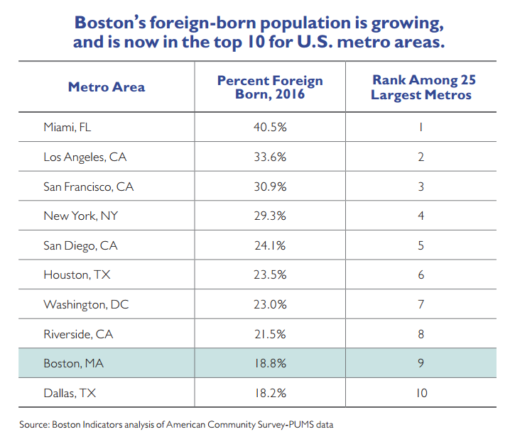
Boston ranks relatively high among the largest 25 metropolitan areas in the U.S. in terms of the share of new immigrants that we’ve welcomed in recent years. At 19 percent in 2016, Boston’s foreign-born population ranks 6th among these metro areas. Boston’s population has grown significantly since 1980, and this is due in large part to an influx of new immigrants, especially Asian and Latino immigrants. In fact, without immigration the city of Boston’s total population would have been relatively flat since 1980. Mostly these new immigrants bring assets that enhance our communities and boost our economy. Those that come without knowing English can have a harder time finding work and moving up, so it’s critical for us to have strong K–12 and adult education programming for helping non-English speakers learn the language.
Conclusion and Next Steps |
In recent decades, Boston has solidified its standing as a great American city. We’re growing, diverse and prosperous. People are attracted here by our history and culture,our universities, our technology sector and our provision of quality public services (at least relative to many other U.S. cities). And, yet, there’s a growing sense that our local economy still isn’t delivering for everyone. Something’s out of balance. Higher-skill workers have abundant opportunities as knowledge sectors of the economy continue to grow. Unemployment is low and our aggregate wealth has helped lead to some important public investments. Increased local property tax revenue, for instance, has enabled the city to increase spending on Boston Public Schools. Nevertheless, poverty remains elevated since the onset of the Great Recession. Many middle-class workers haven’t received a meaningful raise in years. Housing costs are skyrocketing just as our transportation infrastructure is crumbling, making it harder for people to seek cheaper housing outside of the city and still reliably commute around the region for work.
Finding ways to better leverage our economic boom for the benefit of all residents and all neighborhoods has become the central challenge of our time. Fortunately, we’re operating from a position of tremendous strength. We have vast local resources to invest in better workforce training pipelines and we know what it takes to provide better labor force protections, to increase multifamily housing production and to rebuild our transit infrastructure. Success on all of these fronts will require broad civic action and effective coalition building.
Boston Indicators is committed to doing more data-driven analysis on exactly these issues.While this report details the scope of our challenges and teases some high-level local action areas, in the coming months and years we commit to doing deeper research in particular areas so that we as a city can get much more specific about the best ideas for reducing housing costs,increasing residential integration, and creating good jobs for all. We look forward to partnering with many of you in this coming work.
Footnotes
Economic Mobility is Down
1. “Worldwide, Median Household Income About $10,000. Country-level income closely related to payroll to population results,” Phelps and Crabtree, Gallup, December 2013.
2. “Black and white Americans use drugs at similar rates. One group is punished more for it.” German Lopez, Vox, October 2015.
Income Inequality is Up
1. Alan Krueger, “The Rise and Consequences of Inequality in the United States,” Speech to Center for American Progress, 2012.
2. “Productivity” is the output of goods and services less depreciation produced per hour worked. “Hourly compensation” is the inflation-adjusted value of wages, salaries and benefits for production and nonsupervisory workers. This analysis looks at hourly compensation to adjust for variations in hours worked per week.
3. Congressional Budget Office, The Distribution of Household Income and Federal Taxes, 2013
4. Pew Research Center, Income Inequality in the U.S. Is Rising Most Rapidly Among Asians, 2018
Boston’s Middle Class is Hollowing Out
1. Median rent values are from Zillow’s Rent Index for January 2018. Median household income is from the American Community Survey’s 2012–2016 5-year estimate, inflation-adjusted to 2018.
2. We define low-income households as earning less than 80 percent of area median income, middle-income households as earning between 80 and 120 percent and high-income households as earning more than 120 percent of area median income. The analysis is based on adjusted household income, which controls for household size.
3. The analysis in this graph was modeled in part on an analysis done by Tim Reardon, Meghna Hari, and Jessie Partridge in “Beyond ‘Workforce Housing’” from the 2016 issue of MassBenchmarks.
4. Urban Institute, Mapping America’s Rental Housing Crisis
5. Low-income jobs pay average wages less than 80% of the median, middle-income jobs pay between 80 and 120% of the median, and high-income jobs pay above 120% of the median.
Wealth Disparities are Growing
1. Urban Institute, Nine Charts about Wealth Inequality in America, October 2017
2. “Ta-Nehisi Coates is not here to comfort you”, The Ezra Klein Podcast, October 2017
Local Action Areas for Building More Broadly Shared Prosperity
1. Educated and Encumbered, Jeremy Thompson, Massachusetts Budget and Policy Center.
2. “The Transportation Dividend,” A Better City, February 2018
3. The MBTA vs. Other Legacy Transit Systems: How Do We Compare?, Boston Indicators, February 2018
4. Urban Institute, The Costs of Segregation
5. “The Most Diverse Cities Are Often the Most Segregated,” Nate Silver, FiveThirtyEight, 2015
6. Pew Trust, Collateral Costs: Incarceration’s Effect on Economic Mobility
7. Prison Policy Initiative, States of Incarceration: The Global Context 2018
8. “Black and white Americans use drugs at similar rates. One group is punished more for it.” German Lopez, Vox, October 2015
9. FAQ: The Massachusetts $15 Minimum Wage Proposal, MassBudget, June 2018